

Warm and Cool Colors

Have you ever wondered what people mean when they say a color is warm or cool? Like, is green a cool or warm color? Don’t worry; all your warm and cool color questions will be answered here. Everything you learn from here will become an effective tool in enhancing your future art projects.
In this article, we will go into depth about warm and cool colors and their psychological effects on viewers. You’ll also learn how to find the best combinations of these colors on color wheels.
What are Warm Colors?
Warm colors are made up of yellows, reds, and oranges, colors that are often associated with light and heat. That is why these colors always give off a warm and cozy feeling. Other times, these colors are used to portray emotions like love, anger, fear, desire, etc. In fact, 52% of respondents say that yellow makes them feel joy.
Moreover, warm colors appear to be more attention-grabbing compared to cooler colors. Painters use these colors to create focal points that draw the viewer’s attention to specific parts of an image. It helps them better convey messages and emotions in an artwork.
What are Cool Colors?
Now, let’s look at what colors are cool colors. Cool colors consist of blue, green, and purple hues. As you can probably guess, these colors represent elements like water, grass, and the sky. The emotions these colors give off are of a dual nature. So, depending on how they’re used, cool colors can represent calmness and serenity but also sadness and depression.
In artworks, cool colors are usually used for creating backgrounds. This creates a sense of distance between the image and the viewer, with the cool colors seeming far away.
Warm vs Cool Colors on the Color Wheel
A color wheel is a circle-shaped chart that shows the relationship between various warm and cool colors. In a color wheel, warm and cool colors are arranged according to their color temperatures, from warmest to coolest.
The wheel portrays that the colors opposite to each other create a strong contrast when paired together. In comparison, colors that are beside each other on the wheel create a harmonious blend.

Artists and designers use this chart as a guide for choosing the right colors for palettes. The arrangement helps them pick a combination of colors that go well together. They can also use it to find strong contrasts or blends of chosen colors.
Division of Color Wheel
In most color wheels, warm and cool colors are split down the middle. But if we look at it more thoroughly, the colors are divided into three types:
- Primary Colors: Red, blue, and yellow are said to be primary colors. They are called that because they are considered the fundamental colors. Every other color is created by mixing a combination of the three. On the contrary, primary colors can’t be created by any mixture of colors.
- Secondary Colors: These colors are created by joining any and only two of the primary colors together. For example, mixing together yellow and blue makes the color green. The other secondary colors, purple and orange, are made the same way.
- Tertiary Colors: These colors are made by adding one primary color with one secondary color. An example would be mixing red and orange to create a red-orange shade.
All these colors have a place on the wheel. They go on to slowly change in shades of warm colors to cool colors.
How to Use Warm and Cool Colors in Artworks?
There is a set of helpful rules when crafting with warm and cool colors. Whether you’re using watercolor paper or experimenting with paper quilling, these directions will help you:
1. Use Warm Colors for Emphasis
As mentioned before, warm colors have the ability to grab a viewer’s attention before anything else in a design. So, you can use that to your advantage in many ways. You can apply warm colors to the focal point of your art. Besides that, you can apply them to other areas that will highlight the focal point.
For example, if you want to paint a flower garden, use reds and oranges for the central flowers. They will then stand out against the green grass and catch the viewer’s eye.
2. Use Cool Colors for Distance
Since cool colors appear farther away in paintings, they are most often used to create backgrounds. They are also often used for wide-shot views. For example, painting distant mountains in shades of blue and purple in a large landscape painting.
This effect of creating far-away objects with cool colors is called atmospheric perspective. These colors make objects look less prominent and distinct. It helps mimic the effect and illusion of distance in your artwork.
3. Use Warm and Cool Colors for Contrast
It also helps to create a balance of both warm and cool colors to make a visually stimulating contrast. Adding cool colors into the background also pushes the warm colors forward, making them more vibrant. For example, if you want to paint a sunset of yellows and oranges, paint the sky in light blues. It’ll make the sun look more vibrant and alive.
So, if you have a predominantly cool color palette in your artwork, be sure to add some warm colors as well. The same goes the other way around. If you want to further experiment with color contrasts and combinations, you can try paper marbling projects.
4. Be Aware of Relative Color Temperatures
Relative color temperature refers to how warm or cool a color seems compared to the colors around it. That means when two colors are applied next to each other, they affect how we perceive each hue. So, if a warm color like red-violet is placed next to red, it appears cooler. However, it would appear warmer if the same color is placed next to blue.
So, it’s important to remember that you’re not limited to reds, yellows, and oranges when choosing warm colors. You’ll be free to mix and match with colors to create the perfect palettes for your art.
5. Use Color Psychology
As mentioned before, warm and cool colors have the power to evoke emotions in the viewer. Warm colors bring out a happy and cheerful mood, while cool colors create a calm or somber feeling. A great example of how colors affect your mind is therapeutic coloring.
You can use this psychological effect of colors to craft symbolism in your artwork. It’ll help enhance the meaning behind your work and make it more impactful. For example, if you’re making paper dolls, apply warm tones to their hair and dresses. It will give the dolls a happier and livelier appearance.
6. Work with a Limited Color Palette
A limited color palette can preserve a sense of harmony and cohesion in your artwork. It can help focus on creating a relationship between your chosen colors rather than frantically searching for more. You’ll be able to easily create a unified color scheme that brings your painting together. It’ll all add up to create a balanced and aesthetically pleasing work for the viewer.
Furthermore, sticking to a limited color palette helps enhance the impact of your artwork. The harmonious arrangement of only a few colors sharpens the artwork’s composition, symbolism, and emotion. It brings out a more immediate and genuine reaction from the viewer.
Conclusion
All of this information might be alot to understand. But the more familiar you get with warm and cool colors, the more you’ll get the hang of it. Just remember to experiment with different color contrasts, work with a limited palette, be mindful of color temperatures, etc.
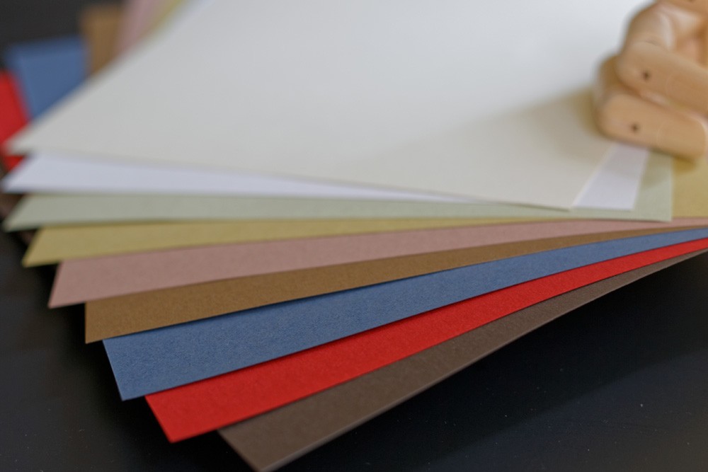
If you’re looking to try out some colorful paper projects, contact us at PaperPapers. We offer a wide assortment of colored papers you can use to create various kinds of artwork, cards, and origami.


One Comment